

The Lighthouse’s inaugural Lighthouse Late event held an ambitious programme of design, music and film staged across all five floors. Central Station’s Kim Stewart was in attendance to bring you the details from the night.
Stepping into The Lighthouse last Friday, I was greeted by the design legend himself, Ken Garland. In my bewilderment, he asked if this was my first time at The Lighthouse. “Nnn-oo” I stammered. “I’ve only been twice and will definitely be coming here more often…there’s a talk upstairs I’d avoid as the guy’s had way too much wine” he responded. Chuckling, I made my way upstairs where Scott Paterson of Sons and Daughters had control of the decks.

Ken Garland | Ken Garland & Associates
Going against his own advice, I went to see the slightly intoxicated Ken Garland speak about everything from William of Orange to the recent Scottish Referendum. His lively presentation was a condensed history lesson of murals, posters and signs from republicans, unionists and protestors.
With so much going on, it was impossible to see everything but thankfully things had been delayed upstairs and I managed to catch Tony Brook’s presentation. The cricket-loving Creative Director used Field of Dreams’ famous quote “build it [and they] will come” as an analogy of Spin‘s attitude towards their work; self-initiated motion graphics projects led to designing Channel 4′s identity. Brook also discussed his publishing venture with Adrian Shaughnessy, Unit Editions which sees their second manual on design and identity guidelines released next month (aptly titled Manuals 2).

Tony Brook | Creative Director Spin

Gabriella Marcella | Risotto Studio
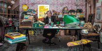
There was a short recess before the next talk and so I headed downstairs to see what was happening in the workshops. Gabriella Marcella from Risotto Studio was demonstrating her risograph printer and Alice Dansey-Wright offered the opportunity to contribute to her work ‘Legitimate Likenesses‘ which will soon be exhibited at The Lighthouse.
Finally, Jonathan Barnbrook discussed his controversial album design cover for David Bowie’s The Next Day. His design underwent a great deal of development work over three months, culminating in a “reductive design.” Barnbrook went on to explain typography as representation of language. His own Mason typeface (originally titled ‘Manson’ after the serial killer Charles Manson) portrays beauty and violence. He described the oddity of seeing people tattooing their bodies with his typeface.
Claiming “designers have to take responsibility for the work they choose,” Barnbrook showed the work he created for Adbusters and Occupy London. He has turned Coca Cola down three times as they represent “the worst of American Capitalism.”

Jonathan Barnbrook | Creative Director Barnbrook

GFT Short Film Programme
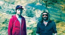
Throughout the night there were short films from Glasgow Film Theatre and a screening of Stuart Murdoch’s (Belle and Sebastian) God Help the Girl, as well as performances by Ella the Bird and James Yorkston. With such a busy programme, unfortunately I didn’t get the chance to see these. Overall, this event marks the beginning of something exciting happening in Glasgow. In a city renowned for its visual art, The Lighthouse is actively encouraging new dialogues amongst designers and creatives.
Words & photos by Kim Stewart
More: Website | Facebook | Twitter
//////
Looking for more blogs? Visit here.


Comments