I’ve long been convinced about the value of collaborative working, but equally ambivalent about the virtues of design competitions. Perhaps the idea of rating designs against one another, outside of the context for which they were made, seems to undermine the way in which design generates value by responding to context. Perhaps the effort put in by entrants to traditional competitions is never rewarded. I’m fascinated by these flaws in the process, and how the emerging platform of Central Station might be able to address them.
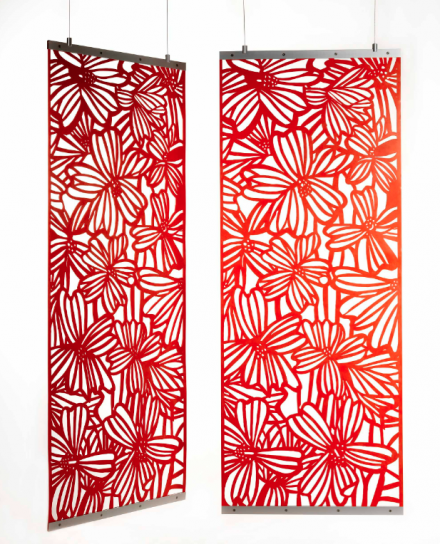
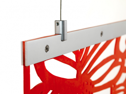
I’m hoping the the way in which the Shadow Screen project is run can throw open the traditionally closed doors of the competition process, and in doing so find new ways of generating value for all who participate. I believe that the best work happens when everyone does what they do best, which is why I concentrate on helping interior designers and architects resolve their product design issues, using my experience of designing and making furniture. For this reason, the Shadow Screen service will never be a vehicle for launching my own designs as such; I am not a graphic, or textile, or typographic artist, but I feel strongly that the best working process should develop and reward input in all these fields.
I’m hoping that over the next two months this process surprises me. If it doesn’t, then there is something wrong. I’m hoping that we get some entries that question some of the contextual issues of the Shadow Screens, and stir up the muddy waters of philosophical, formal and conceptual issues raised by the process of turning shadow into form. I’m also hoping for a certain freedom from an aesthetic that draws from existing ‘patterns’; that suggests how beauty could be formed from the mundane, and reward sustained viewing.
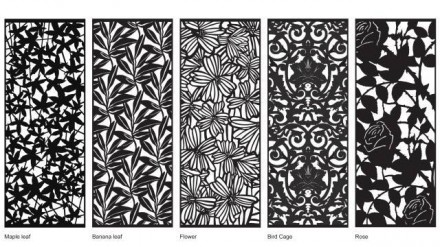
On a practical note, I’ve found that those patterns with a random appearance are more suited to cropping. The Maple Leaf, by Jacueline Poncelet (far left) is by far the most popular, and works well when cropped to any proportion. The current patterns show a strong bias towards natural forms as photograms, but this is not intended as a template for further patterns. If anything, I would like to see greater breadth of subject and form.
I’d love to see inspiration drawn from non-formal sources, too. The idea of negative space being more important than the figure is present in many fields, all the way from anthropology (definition of self through others), through to jazz. When I worked in a hifi shop as a teenager in Preston, resident jazz buff Les imparted pearls of wisdom to make a long days on my feet more bearable. “it’s not the notes your listening to in Jazz, lad, it’s the spaces. When you realize that, the whole thing changes…”
Any comments, either on the process, of the ideas suggested, are very welcome.



Comments