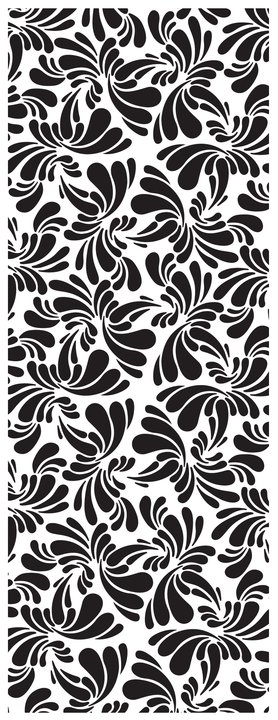
In making the most of this fantastic opportunity to be included in the shortlist for the ShadowScreen project with Kerlaff I thought it be most appropriate to let you in to some of the secrets, background, design and thinking behind the artwork “Electric Bird” that I created for this competition. On first glance of this artwork in the very first seconds of seeing it there is a strong visual clarity full of professionalism, each curve and every teardrop appears stated and proud as if it were a commercial wallpaper pattern work but care to dive a little deeper and there is plenty more to explore.
The artwork “Electric Bird” leads to you so many new places, its modern appearance is actually heavily based in a real old school grid of science and math yet its structure is full of movement and fluidity. The design functions in a variety of ways, its initial visual allows it to appear current and on trend, its make up and design allows an audience to discuss its roots in academia and traditional art forms whilst its movement and swelling forms make it appear fresh and new from every angle.
The design has been created on a bed of grid work designed by the artist and mathematician M.C Escher. Initially his grid was designed to fit tessellating shapes of butterflies. With every edge of each butterfly touching his artwork was debatably flat and lacked an extra dimension that allowed it to be a successful visual rather than just a pattern work. With the Electric Bird design every negative space that flows around each teardrop is just as important as the positive space and therefore lends itself greatly to the shadow screen design. The negative space gives our eyes the freedom to move and link between each form and define our own visual path which in this design is often a fluid journey as we move between the swelling sizes of the shapes in the artwork. If you look closely you can make out each defining wave of the artwork as Electric Bird is made up of one set of teardrops in the shape of a butterfly which is then repeated in circular arrays and endlessly fits together to make the full composition.
Now that you know where the design came from and how it fits together you can take pride in its modern appearance as well as discussing its traditional design structure but what was even more important to me as a designer is to give the artwork a visual purpose to serve as a graphic that speaks volumes about who I am and what I have to say. I have mentioned the artworks fluidity and swelling a lot when I talk about this design and the reason for this is due to the commentary I am trying to insert into its design. I wanted the artwork the have a sense of emotion and mood, in all of my works there are great references to the sea, surf culture, a relaxed but up beat way of life, and so on. This design was put together so that as a Shadow Screen sits in a room it not only is a new piece of furniture it is a voice, an amplifying sound that resonates a mood. The Electric Bird speaks volumes of calm and cool, the way the design expands and shrinks mimics the movements of the waves, tides and the ocean and allows the screen to give out a sense of calm and serenity.
I hope this can bring great clarity to this design and give the opportunity to many new viewers to enjoy the artwork in an array of new dimensions. If you have any opinions on the design, any feelings about the visual or any questions I would love to hear from you. You can write them on the facebook group and I will answer as many of them as I can.

Matthew Kavan Brooks, KavanStudio


Comments