I’ve always wanted to know what went on in the judging process of any project, and I’ve always been bad at keeping secrets. The perfect opportunity opportunity to address both these issues is now here… here’s what really went on.
For those who didn’t make the trek to the Sub Club on Friday, Stephen Cappello was the winner, receiving a cash prize of £500 and a licence agreement for his design, ‘The Devils’ Church’. Four of the remaining shortlisted designs were also awarded a licence agreement, so Kavan Studio, Veeny, and Titas (two patterns) will all have their designs offered as part of the Shadow Screen range. As with the existing patterns, the designers will be paid a percentage royalty based on the selling price for each screen sold.
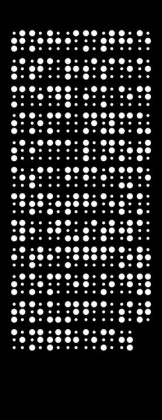
So, how did the judges come by this decision? It’s probably fair to say that the immediate impact of the patterns is hard to shake – it’s pretty clear whether a design is visually arresting, and this rarely changes. When we met for shortlisting, we looked at nearly a hundred entries in total, and it was pretty clear which of these should make it into the final ten. Although we didn’t pick a winner at this first meeting, we all had our favorites. It’s probably fair to say that even though we took pains to keep the comments on the designs fairly equal, it’s hard not to hope that your favorite wins.
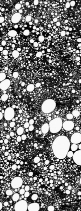
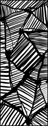
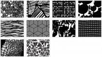
What really showed through from the facebook comments is that each of the patterns works in a different way, and arguably four or five of them could have been the ‘favourite’. It made the final choice immensely difficult. Should we choose the pattern with the most immediate impact (which for me was the ‘bubbles’ pattern by Chris Veeny)? Or the one that received the most positive reactions (the beautiful ‘Smog’ pattern by Daisy Macdonald)? How about the patterns most likely to be used by interior designers looking for a compliment to other materials (Titas’ work)? Or the pattern that looks simple but is actually more complex than it looks (Mathew Kavan Brooks)?
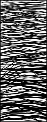
In the end, the shortlist was so strong that I decided to offer licences to the five patterns which were most likely to be commercially viable for use as a cut screen. This decision left some fantastic patterns out, not due to the quality of the patterns themselves, but because they had a major issue with production – Dele Adayamo’s lovely collage of children and balloons, for example, didn’t offer an obvious positive and negative for the cutting process, and Daisy Macdonald’s Smog was stunning but very hard to crop due to the areas of uncut sheet. Daniel Sunden’s Untitled would be great as a piece of art in it’s own right, but hard to incorporate into an interior without overwhelming. The simplicity of Catrin Lewis’ work, though very strong in the right context, could be mistaken for a standard pattern, with the same going for the undulating waves of Titas’ third pattern.
Offering several licence agreements also freed up the choice of winner, and the judges felt that it’s clear concept had been executed in a refined way, pushing both the intellectual buttons but also subtly the right visual ones. What clinched it was that the pattern offered the possibility for customizing a screen to incorporate a hidden message of particular relevance to a client, or a context. It’s simplicity of form might also offer the potential of more economical production techniques, should the volume be sufficient. I’m looking forward to working with Stephen and with all those who have been offered a licence agreement to develop the work.
A huge thankyou to all those who entered, and I hope that the experience has offered some value even for those who didn’t win.




Comments