Social media is still a relatively unknown quantity for a majority of cultural institutions. I’ve become used to turning up to seminars and hearing the envangelisation of social media to artists and galleries, and to an extent have become a part of that too with this very platform. I’ve spent the past 18 months convincing certain folk who would rather someone else deal with ‘all this internet stuff’ that they should pick up these brilliant new tools to find and engage audiences. But at a workshop this week, it was put to me that now social media is a proven winner, printed marketing material had finally met the shredder. The End.
Introducing a social media strategy is an easy win for arts marketeers. Do away with print – save time, hassle and the environment, with the added bonus of being the revolutionary who drags everyone into the 21st Century.
In theory, it sounds great. As black and white as a halftone dot. Except this whole trade-off between design and print, and social media, is a bit of a misnomer. But let’s compare them for a moment:
Print has been around for a long, long time. For the sake of argument lets pick out a landmark year – 1450 – when Gutenburg started getting his fingers inky doing some nice brochures for the Lord. That’s 560 years. Twitter? 4 years. [I’m aware social media was around a bit before that, but then I’m not counting back to The Dead Sea Scrolls, God’s innovative but ill-fated roll-folded direct marketing campaign].
Right now there’s a lot of ‘what’s next?’ questions and prophesizing, and Web 3.0 chin stroking, but no-one really knows for sure where this is all heading. We can see some platforms are already dying (Bebo is the latest casualty, MySpace a hollow Murdoch shell of it’s innovative heyday). Point being, just because this new stuff is great – and we should all embrace it – we shouldn’t chuck out all the brilliant old stuff. So, here’s my 4 part plea to the design/print naysayers…
First off, adopting Social Media shouldn’t be about giving design a bodyswerve. Effective social media marketing is designed – it’s a nuanced combination of images and text just like anything you put on paper, and needs to be considered in the same way.
Secondly, Social Media shouldn’t be thought of as a cheap alternative to design for print – if anything social media takes more time – once you’ve created something it’s only the beginning of a journey that requires constant feeding, monitoring and interaction.
Third, if we’re talking solely about arts marketing, then surely we’re still appealing at core to a visual culture that places intricates values on form, content and aesthetics? Rather than killing off printed material, social media essentially presents an opportunity to focus on making smaller runs of better print. As a designer I take little joy in squeezing on more and more information that could be communicated on a website, or sending out large runs of cheap, digitally printed flyers. I’m a fully paid-up stock sniffing, type fetishising, paper grammage nerd, so I’m biased… but when you are communicating something as potentially complex as artists’s work, combined with the values of a gallery, isn’t it worth the effort to attempt to represent that properly?
Most importantly, design and print is a hugely important part of visual culture, and works in tandem with visual art. A great example of this is Neil McGuire’s piece I wrote about a few weeks ago that was produced for the ECA Masters show and in itself became part of the exhibition.
There must be more examples, and better arguments. Am I preaching to the converted, or is print pulped?
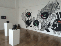
Image: Invite for Baldvin Ringsted, +44 141 Gallery by The Press – Emlyn Firth/Edwin Pickstone


Comments