STV Creative ventured off to Robert Gordon University’s Gray’s Degree Show, where it took them three trips before the could be satisfied they’d seen everything there was to see. With so much to offer, they disciplined themselves to choose just five top pieces. Read their top five below (in no particular order)…
Sabine Bein – BA (Hons) Design for Digital Media

Sabine work was a real stand out. Her 3D and After-Effects projects were of a well polished standard that easily translates to professional standards and expectations.
Use of colour, tone, fonts and layout were all well considered with a beautiful grasp of balance and tone, executed with a resolute neatness that is always the mark of great graphic design. Sabine’s fictional idents for Channel 5 and typographical style visuals for a fictional documentary on 1950’s fashion were standout pieces in particular.
With such quality being produced at this level it’s exciting to think what will be produced when these skills are applied to future ventures. We will watch this space (and our televisions’) to keep an eye out for just such ventures…..
Kevin Cameron – BA (Hons) Visual Communication

Kevin’s work stood out for a number of reasons. The most important being something that we hail highly within our own department – the idea. Kevin’s work was prolific with ideas. From conceptual to commercial there was a good run of consistency running through his output for the year. Coupled with the idea is the inventiveness. Perfectly demonstrated by his Becks beer bottle top idea (fig1) to help promote responsible drinking and deter drink driving. A clever idea and simple execution which could easily be adopted by the brand at little cost.
Another highlight was Kevin’s magazine cut outs. Characters in editorial illustrations were carefully cut out and propped up with a single carefully placed pin to create depth of field and subsequently bring the images to life in a playfully delicate way.
But what also made Kevin’s work stand out was the volume. There was much to look at with several inflections of multiple projects on show; all consistent in quality, ability and examination of the subject. Such tenacity and exploration will see Kevin continue to discover and create brilliant work as he exits the fold of university.
Shona Hutson – BA (Hons) Print Making
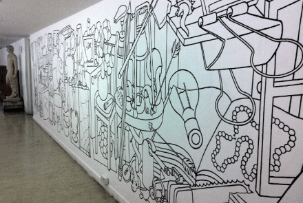
Shona’s work is distinctive. Heavy, bold lines make up blocked prints composed of outline shapes layered and built upon to create a composite image. Interestingly some of her work features different materials to add texture and colour to the various components – most notably her ‘chair’ composition. The feel is graphical but seemingly organic like a gentle form of pop art. Her wall design which took up much of a corridor would be at home in Berlin. Her work in approachable with (quite literally) many angles to study and appreciate with each view. The style will lend itself to many other subjects in years to come. It would be interesting to see them as they come together.
Seila Sysberg & Johanna Lyczko – BA (Hons) Photographic & Electronic Media
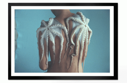
Tucked behind the sculpture section was a wall of large photograph prints. The space was probably ideal as the lengthy, mostly uncluttered approach to the work allowed them to be undiluted by other pieces hoping attract eyes and interest. But even amongst a busy set of images these particular group of images would stand out with ease. With unusual subject matter that leans on surrealism, these images invite wonder and debate. But far from mere concept, the execution of the images merits praise and admiration. Some images have been captured in a light that has pushed the camera’s gain control settings. Far from the purist’s taste the grain is evident but bestows softness to the image that from a distance makes it look like a fine details pastel drawing. A particular favourite was the ‘Octopus’ image. A naked model displays two octopus (or should that be octopi?) carcasses which drape over the shoulders and down the models back. The image is both striking and stark in equal measure. The colour palette that makes up the composition of the scene agrees with perfectly with each other. The meaning of the image is elusive and presumes to be questioned. It may question society’s use of animals for fashion purposes, or it may be an attempt to discover beauty in the seemingly ugly, or it may just be a really interesting image. Whatever conclusion you arrive at the image is hugely enjoyable on many levels.
Another interesting aspect to this work is that it is the work of two artists. Both working in partnership to discover, explore and capture ideas and concepts; unusual but ultimately in our eyes, successful.
Nicola Walster BA (Hons) 3DD Ceramics/Glass/Jewellery
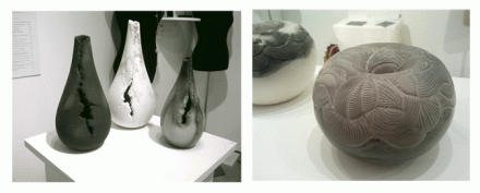
Tucked away in the Porto cabin section was the ceramics and glass section. It should be he said that all displays were high commendable with some beautifully fashioned objects on display.
However, there was one set of pieces that exhibited particular beauty and splendour.
Nicola Walster’s work consisted of hand carved stone shapes and vases. The control and flow of the etched linear patterns that laced the objects had the ethereal charm of ancient Nordic artefacts. But where each creation evoked a spirit of history it was annulled by the modernity of shape or features such as the flaking split that tears down the side of a series of vases. The rugged splits seemingly natural at first sight but betrayed by the uniformity of reproduction that suggests that it was the hand of the artist that imbued the aesthetic of the design.
Each of Nicola’s pieces resonates with the tactile craft, skill and rarefied technique. All could claim to be classics and each will find their way into homes to be prized or gallery plinths to be enjoyed by the masses. Beautiful work.
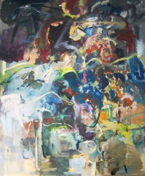
Other work that caught our attention on a big was Craig Harpers’ paintings, Elizabeth Legges’ plaster reliefs, Hannah Malones’ red string instillation, Mark Rennies dark drawings & paintings, Marion Leipers’ prints and Jade Murrays paintings. All great work.



Comments