Denise Ross is a UI Designer and UX specialist based in Glasgow. She has over 10 years experience working with world class brands such as First Group, Barclays, NHS, Forestry Commission and Fujitsu.
Denise was recently selected to take part in the Geeks in Residence programme – a prototyping and innovation project founded by Sync for Scotland’s cultural sector. The project pairs technologists with cultural organisations to explore the creative application of technology. Denise was paired with Stills, the Edinburgh based contemporary photography gallery and learning center. Here Denise describes the experience in her own words.
About the project
I was delighted when I found out I had been selected to take part in Geeks. It came at just the right time as I’d recently completed a long corporate contract and was craving a more creative project within the cultural sector. It was particularly great being paired with Stills since I love photography and at the time I’d just completed producing a fanzine, So & So, that included all my own photographs.
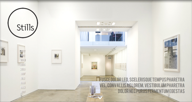
If taken at face value it would be easy to assume that Stills is a recently established gallery – the aesthetic of the space is sleek and minimal. And of course by its very nature as a contemporary photography gallery the works on display only enhance this feeling of modernity. When I was told that Stills was actually established in 1977, albeit at a different location nearby on The Royal Mile, I was surprised but also immediately saw an opportunity to tap into what would undoubtedly be a vast and rich history.
Man Ray, Cornel Lucas, Richard Learoyd, David Goldblatt and Walker Evans are just a few of the highly revered photographers who have had work featured here over the years. Subsequently there is an amazing archive of historic exhibition posters. I began to think that it would be great if I could represent this rich artistic history through a digital visual timeline.
The first time I visited Stills it was evident that there is a lot going on beyond the gallery. The building is a labyrinth of intriguing creative spaces such as dark rooms and editing suites, as well as quiet places to sit with a cup of tea and a book from the well stocked library. I also noticed that it would actually be quite easy to miss these other parts of Stills as there is no signage indicating what is beyond the gallery itself. It would be useful if visitors could get a sense of this before they visit.
With these two concepts in mind, time and space, I began working on a series of rapid prototypes.
Exploring the physical space of Stills
3D Model
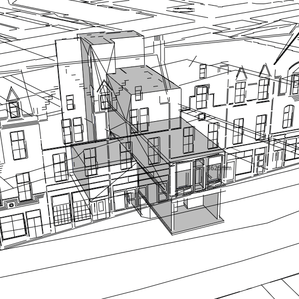
I explored methods of digitally visualising the physical gallery space, initially through a 3D model made in collaboration with Maklab – a digital fabrication lab in Glasgow’s lighthouse. I used SketchUp to work with the model and had a lot of fun styling it and creating animations – it’s a great tool for people like me who are just starting out working in 3D.
Sketchfab
The challenge was then to find a method of presenting the model online. I tried various solutions before finally going with Sketchfab – a web service for publishing interactive 3D content online in real-time. It uses WebGL and HTML5 to display it in the browser:
Floorplan
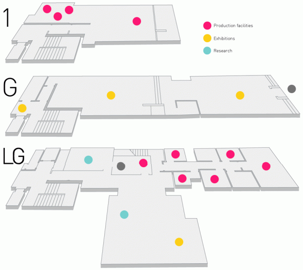
While the 3D model was an interesting prototyping exercise, it would have taken much more time and experience to produce a tangible user interface. We had also initially talked about visualising the building using an exploded view drawing which is essentially a flat graphic, so I eventually revisited this idea and came up with an interactive floorplan. I used CSS3 transitions to create the hover effects, making it a very lightweight UI, easy to embed in pages within the Stills website.
A visual history of Stills
Stills was established in 1977, and is Scotland’s most revered center for photography. I wanted to create a digital experience that would allow the user to revisit the history of Stills. I created a series of prototypes that explored the visualisation of time, making the most of an amazing archive of exhibition posters.
Parallax Scrolling
The first iteration of the Stills timeline was inspired by the parallax effect – a recent trend in web design where users can scroll multiple objects simultaneously at different speeds, creating a feeling of time passing. The term is derived from the Greek “parallaxis”, meaning “alteration”. Nearby objects have a larger parallax than more distant objects when observed from different positions, so parallax scrolling can be used to determine distances.
Lightbox
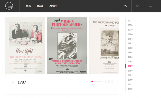
The main focus of the timeline is the posters and I wanted to present them in a way that would show their design evolving through time whilst giving users the opportunity to view the artwork in detail. The second prototype uses a similar navigation method as the original version whereby users scroll the page while images load in the background, or they can choose to select a year. All exhibitions for a given year are displayed together and the posters can be opened in a lightbox allowing them to be viewed up close.
Timeline
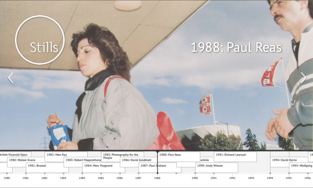
The final version of the timeline revisited the full screen size image technique of the initial prototype, and introduced a more intuitive scrolling navigation method. I used Timeline JS – a JavaScript based solution that can pull in content from a variety of sources such as Flickr, Twitter, Google Docs and more. It can be served up through a Google spreadsheet making it very easy to manage, although the version you see here stores the content in our own WordPress install and uses JSON to manage the data.
Outcome
I am truly proud of the work we have produced together. When I think back to our initial meetings, when we had a blank canvas and only a vague idea about how to approach the process, I feel so satisfied with the outcome. The approach was completely new to us all – usually an organisation comes to me with requirements and I try my best to provide a valuable service. It just goes to show what can be achieved when there are no set goals, and when creativity and innovation are the driving forces.
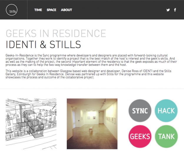
I have created a microsite that documents the processes and output of the project.
I’d like to take this opportunity to thank everyone involved: the lovely folk at Stills, Evan, Claire and Sarah, for being congenial hosts and giving me such a warm welcome and support through the project, and Sync for giving us the opportunity to take part in the programme. In particular I give my gratitude to my mentor at Sync, Devon, who’s enthusiasm, encouragement and guidance was invaluable.



Comments