Recent Glasgow School of Art graduate Emma Tracey reviews this year’s degree show for Central Station. Working in film and photography, Emma offers her insider impressions of her fellow graduates’ work.
It’s that time of year again, summer has sprung and the art & design students of Glasgow have collated the sum of 4 years experience into one eclectic whirlwind of a show. The Glasgow School of Art Degree Show began on 13 June and continues until 20 June, featuring work from graduating students across the schools of Design, Fine Art and Architecture.
Due to the fire which devastated the Mackintosh building this time last year the Fine Art show is taking place in the Tontine Building in the Merchant City while the Design show is running in the newly built Reid Building in Garnethill. Despite the physical distance separating the two shows, the work exhibited across the two venues maintains the strongly unique spirit that ties The Glasgow School of Art students together.
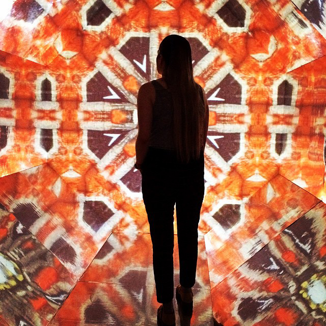
Entering the Tontine Building I was excited to see how the Fine Art students had adapted to their new space and curious to find out how it affected the work they produced. The first piece that caught my eye was Jess Kelly’s beautiful installation ‘Translucent.’ The work effectively acts as a walk-in kaleidoscope with seamlessly moving images projected behind a screen within the structure. The viewer becomes immersed within the installation and becomes part of the artwork itself.
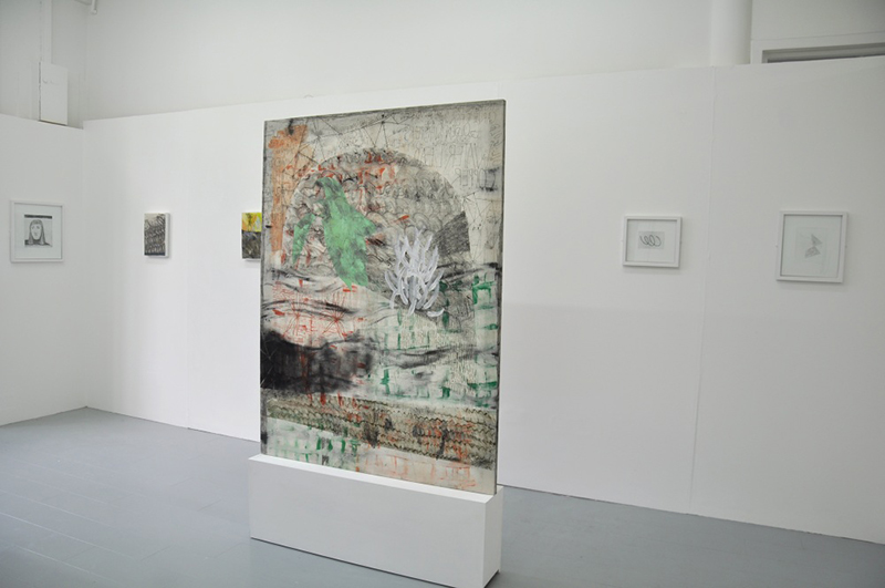
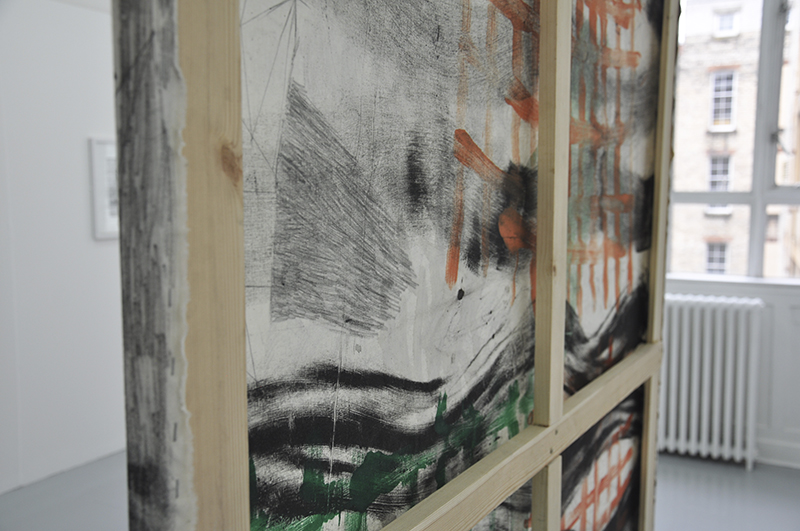
From sculpture I moved through to the painting rooms, this is where I found Anna Thomson’s work. Her large-scale paintings display serious skill with a deep understanding of texture and subtlety of palette, a perfect combination of bold and understated.
After leaving the bright white of the painting room, I ventured into the darkness of a windowless alcove where I bunkered down on a huge beanbag, intrigued by a voice that echoed around the small room. When the visuals began, I knew this was a piece worth getting comfortable for.
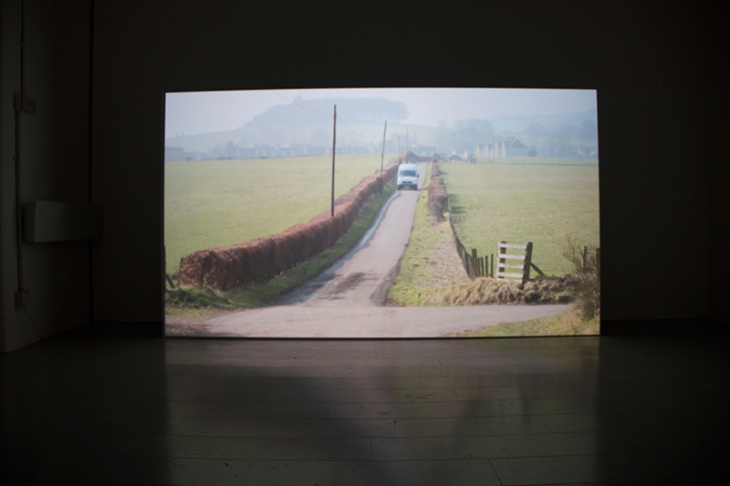
The short film by Jack Boutwood explores collective memory through an intimate and engaging series of pondering thoughts and observations on modern existence. This skilfully written narrative is refreshing in its honesty and simplicity, nostalgically reminding the viewer of the beauty in the common everyday.
It was time to move on, although I could have stayed much longer revelling in the wonders of the fine art studios, I knew there was so much more to see. Entering the Reid building you cannot help but be overwhelmed by the sheer scale of the place; it is without doubt a fantastic building to exhibit within. As I enter the Communication Design Department I was struck by the vast array of varying styles of work, ranging from fine art style large-scale installations to cutting edge graphic design.
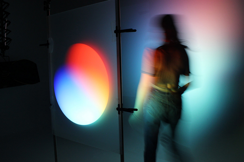
Romany Rowell, Time Through Colour
It was the work of Romany Rowell that first caught my attention, in this thought-provoking and frankly very clever piece of work, Romany investigates the way in which time is measured – in numbers – alters our perception of time. The aim of this project is to challenge the viewer’s perception of time by use of colour, light and movement.
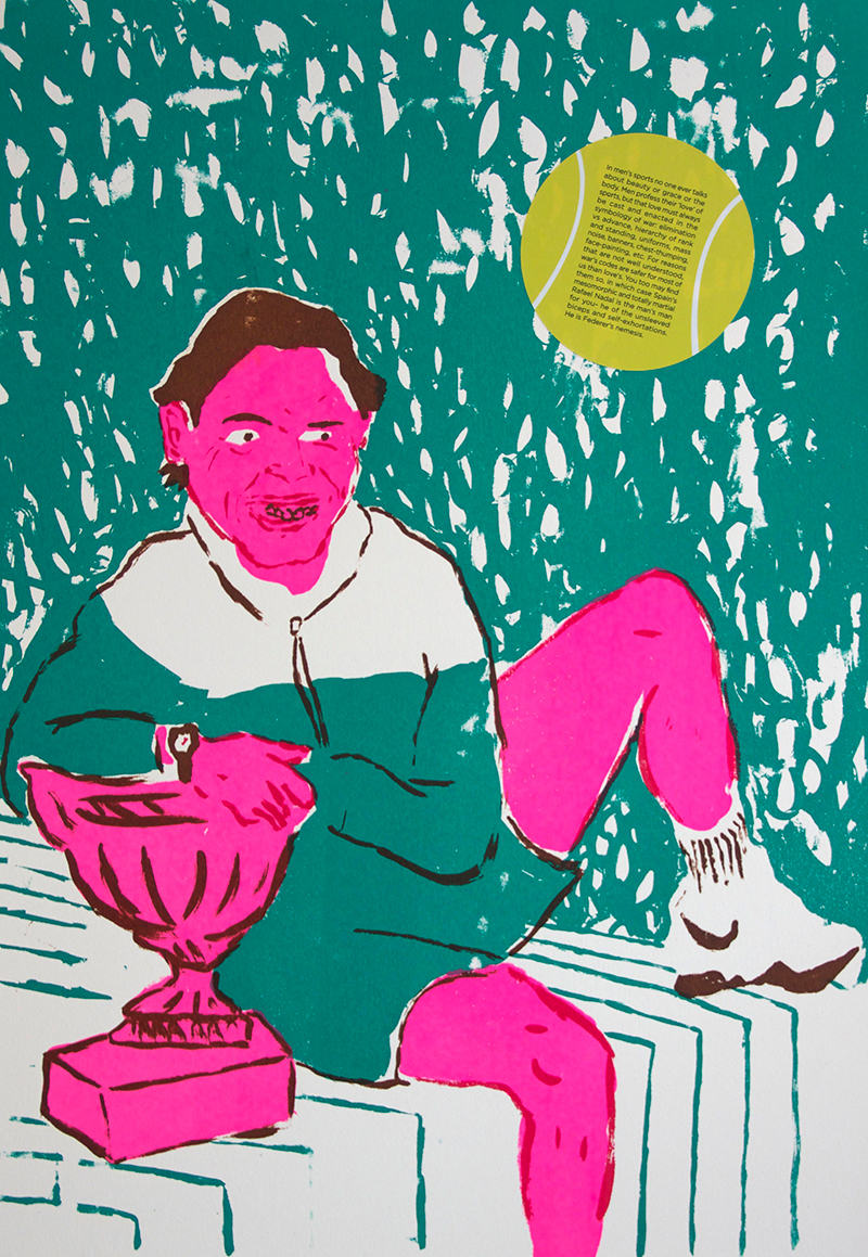
At the other end of the Communication Design spectrum is the highly appealing and humorous work of Hannah Jane Nixon, her brightly coloured screen prints display a bravery and uniqueness all of her own. Obviously inspired by popular culture, Hannah has also made a comic book based on the childhood of tennis superstar Roger Federer.
Another Illustration graduate who stood out for me was Sam Russell Walker.
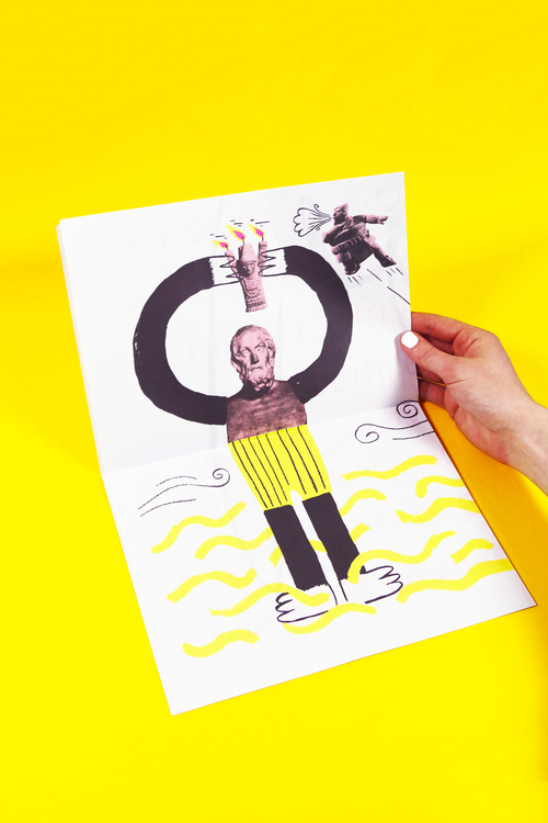
Sam Russell Walker, Bygone Magic Stone
‘Bygone Magic Stone’ is a double sided poster book born out of the idea that each generation looks to their predecessors for inspiration, imparting their own interpretations, creating a kind of Chinese whispers through time.
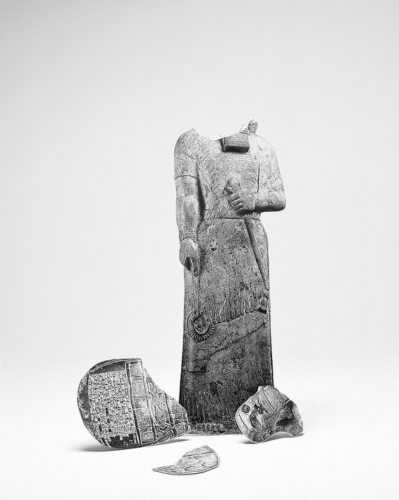
Calum Douglas, Only the dead have seen the end of war
From the Photography department of Communication Design I spy the work of Calum Douglas. Calum produced a series of powerful images as a response to the unseen and misunderstood aspects of war. The series shows a body of simplified and re-appropriated images that represent key events throughout the Middle Eastern conflict over the past three decades. The way in which the images are presented invites the viewer to question what they see.
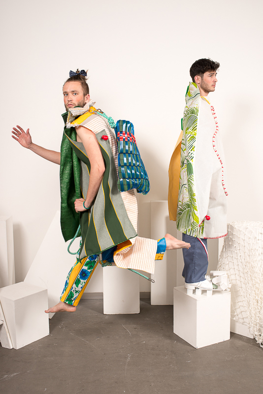
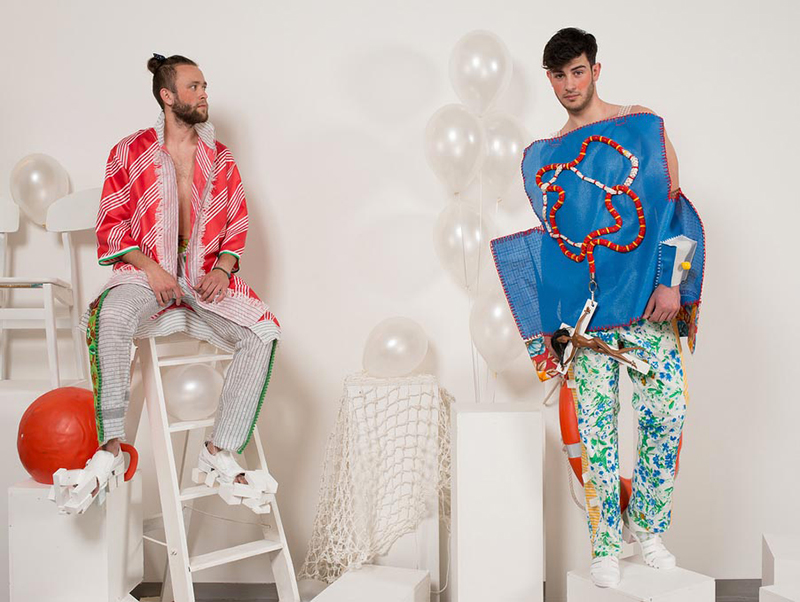
Leaving the Communication Design department my head is spinning with all that I have witnessed but I am eager to see more as I venture into the fashion and textiles exhibit space. In this room I feel like a kid in a candy shop, the colours and textures of the work screaming out to be held, stroked and worn. Hardly knowing were to begin I am drawn, as if by a tractor beam to the explosion of pattern on display by fashion designer Luis Miguel Sanchez Garzas; nothing about this work is mundane, everything about it makes me happy.
There is a passion for abstract forms and playful use of scale alongside a surreal use of found objects, all of which speaks of a great humour that warmly invites the viewer to rethink both traditional forms and functionality within fashion.
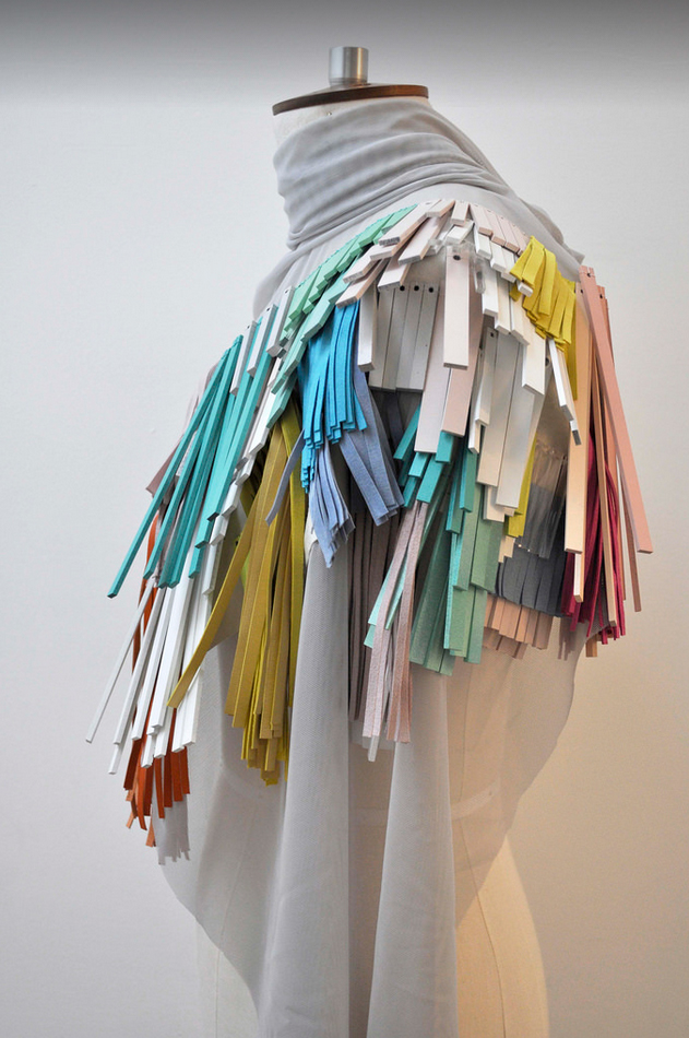
I was also very impressed by the work of Elinor McCue, who, like myself is a great fan of fringes. Elinor uses a mixture of hand cut leather, laser cut mdf and acrylic to create her wonderful fringed panels.
All in all this year’s Glasgow School of Art Degree Show has been a great success with too much quality work to go through in one review, I have not even mentioned the work of Product Design or Architecture but I strongly advise taking a look at the intriguing designs of Cheng Zhai Wei and the exciting concept piece ‘Tent in the Tenement’ by Michael MacFarlane.
If you want to see more, the show will be running until 20 June from 10am-5pm daily. Information on artist and designers who are participating in the show can be found here.
See Emma’s work online here.
More: Website | Facebook | Twitter
//////
For more events, see our Weekly Bulletin here.




Comments