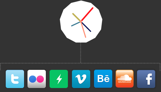

Today I stumbled across this visualisation of friendships on Facebook. It’s worth a look. It’s very beautiful, if nothing else (although there’s of course a lot else…take a peek at the spot where China should be.)

Last night I watched a documentary on BBC4 called The Joy of Stats. I also found out about Culture Hack Day, being held at the Royal Opera House in January, to play with data released by a number of creative institutions.
BBC also created a documentary about diagrams in here. I haven’t watched it yet, but imagine it deals with overlapping themes.
I suppose these things have got me wondering…
What do we (as in creative types) do with data, and why do we do it? Where are we going with it and what does it mean to audiences? I haven’t looked around much, but my gut feeling is that creative use of data is generally paper or screen-based at the moment. Is that true?
What happens if it moves into more immersive environments? So it all becomes that bit more experiential and…theatrical? Is there potential for exploring real-time relationships, representing them, and letting people interact within them?
Any more / better / bigger examples very gratefully received.
//
Member comments transferred from previous website:
Neil McGuire- More on this topic here
Would echo the reference to tufte made earlier in this thread. His disassembly of the ‘cognitive style of powerpoint‘ sort of pre-dates some of the issues with the current vogue for data visualisation that often does little to bring clarity to the situation, and are instead an exercise in vector-based decoration.One the most powerful ‘data’ visualisations that i can think of, and which had a direct effect on the social/political activities of the day was this one which had a direct impact on public perception of slavery, and contributed in some way towards its abolition.
The interesting thing for me is as much in the politics – designers interacting with data but where the outcome isn’t necessarily a ‘neutral’ or benign rendering of it. Had the good fortune to be in amsterdam at the weekend and saw daniel van der velden of metahaven talking about their recent work on/with/for wikileaks… a complex set of data but the outcome of this project as much to do with the politics of the situation and ‘identity’ as to do with how the data works and how it is connected.
In terms of theatre, while in amsterdam met up with a friend who is now working at Lust / LustLab – they just did a project with an opera company using projections and voice triggered rss feeds as part of, and responding to the performance.
other useful resources: visual complexity.
MitchMiller: Well, data visualisation – in this case oral testimony and common perception – is the core of what I’ve been wrestling with on my (shameless plug alert) dialectogramsproject. You can do fascinating stuff with quantitative data, but qualitative can be more tricky. My approach at the moment is quite ‘straight’ graphic art, but I think there’s interesting work to be done with interpersonal relationships and their representation – an idea I had was to use circuit schematics to depict social relationships then build whatever circuit results, to see if the world goes ‘pop’ when you switch it on..Check out the work of Edward Tufte – http://www.edwardtufte.com/tufte/ he’s seen as the godfather of data visualisation in America, Mark Lombardi and the latest issue of Varoom magazine which has some amazing ‘word’ pictures.
clyde9: for info graphics try http://infosthetics.com/
unfortunately the bbc4 doc on diagrams was a bit of a lemon, 15 mins of story stretch out over half a hour, with regular “bite sized” recaps . . . what happened to actual documentary making?


Comments