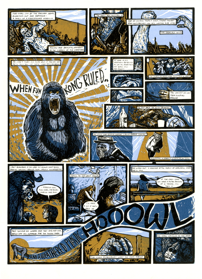
The Written Image is a project curated by Edinburgh Printmakers and the Scottish Poetry Library. Selected printmakers and poets were encouraged to form collaborations, the culmination of which is now exhibited at Edinburgh Printmakers until 21 December (with a possible tour in the pipeline). The fundamental idea was that the poet would supply a poem or some writing, from which the printmaker would create a print or anything that was made using some form of printmaking.
Matthew Carey Simos was born in Welkom, South Africa in 1984. He grew up in Greece where he had the chance to explore a large part of the country, as his father’s profession required the family to move around quite often. He graduated from Coventry University in 2007 with an Honours degree in Illustration. For the next two years, in rural Greece, he spent his time building traditional Greek musical instruments and drawing strange creatures. In 2010 he moved to Edinburgh and took up relief printmaking a year later. He is based in Edinburgh, currently works as an illustrator/printmaker and specialises in reduction lino printing.
Rebecca Sharp is a writer from Glasgow, working in poetry, performance and prose, often in collaboration with other artists. Works include The Ballad of Juniper Davy and Sonny Lumière (poems and score, book/CD and performance); Fathoming: setting poetry to silk (poems and silk objects, with artist Eva Fulinova); Little Forks / Forcan Beaga (prose, performance and book), touring in English and Gaelic; The Tiger Act (books by Roncadora/Hugh Bryden); Unmapped with painter Anna King, which exhibited at StAnza and the Royal Glasgow Institute of the Fine Arts; and Rules of the Moon, a new performance with sound artist Philip Jeck, first performed at the Bluecoat in Liverpool, touring in 2014. Rebecca is currently working on a new commission for Mr McFall’s Chamber ensemble – Remembered / Imagined, with composer Ailie Robertson, using the archive of the Department of Scottish Studies at Edinburgh University.
Statement:
Comic strips and graphic novels have been a significant source of artistic inspiration for Matthew over the years. Most importantly, in his early twenties, he was introduced to Moebious, one of the most influential artists of the Franco-Belgian tradition. Since then, through his artwork, he has strived to capture the essence of what he felt when reading the likes of The Incal and Arzach.
Rebecca shared this interest and was keen to explore a more literal, overtly visual form of storytelling, having worked on a number of more abstract collaborations in recent years. So the decision was made to create a graphic novel style linocut.
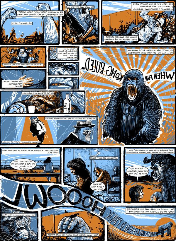
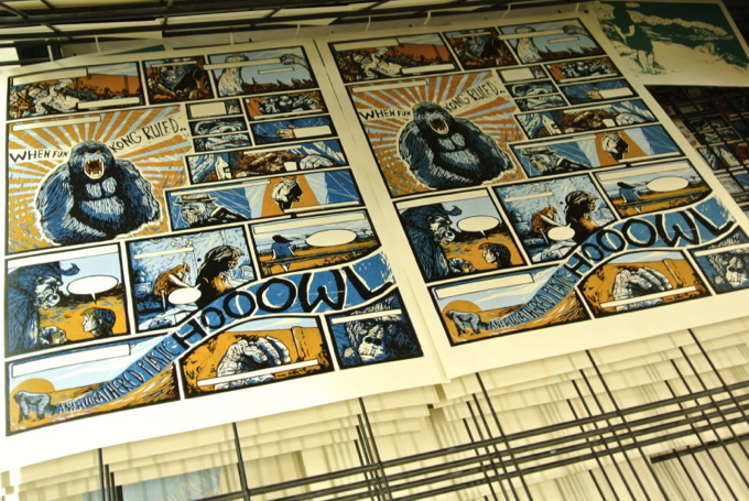
Rebecca had the concept for the poem already in mind – the story came from a train journey from Liverpool (where she is currently based) to Glasgow, when she saw from the window a large gorilla figure in a scrapyard (exactly what she describes in the first stanza / frame). She saw the figure a few times on the same route over the course of about a year (though sadly it now seems to be gone), and started to imagine what his story might be.
Seeing Matthew’s work, with its allusions to graphic novel form and an otherworldly aspect, Rebecca knew Fun Kong had found a home.
The process:
R: We met at the Scottish Poetry Library in June and quickly realised we had a lot of common interests, so ideas started to click into place straight away. I’m based in Liverpool, so I knew this collaboration would be quite different to some of the others I’ve worked on, given that we couldn’t just meet up at the drop of a hat. We started emailing ideas straight after meeting each other.
M: I knew, right from the beginning, that this project had to be based on a comic/graphic novel format. I had been looking eagerly for a chance to do something in such a format but was generally put off by my lack of writing skills and daunted by overambitious collaborations.
Furthermore, the curators encouraged us to create prints which would incorporate the text in unconventional ways. They made it quite clear that they did not want diptych formats with text printed on one side and an image on the other.
R: I was open to the idea of creating something entirely new for the collaboration; to spark off Matthew’s work and see what emerged – as it happened though, I had a concept already floating around my head that hadn’t found a home for about 2 years. It was the story of Fun Kong, and seeing Matthew’s comic-style prints and having talked at length with him about narrative styles and the combination of fantasy and realism, it seemed like the perfect fit. I hadn’t written a word of the poem/story before then, so it seemed clear that this was the opportunity Fun Kong had been waiting for.
I sent Matthew a draft of the poem as soon as I could, so he could see the story laid out (albeit in the form of a poem) and see what images and ideas I was playing with. I wrote with Matthew’s work in mind, so that the symbiosis would be there from the start, ingrained in the text, rather than handing him something fully formed with no breathing space.
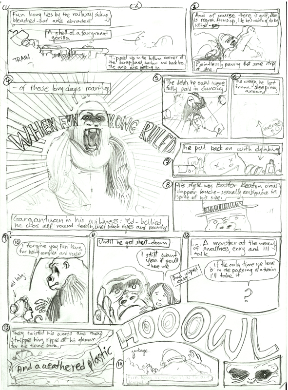
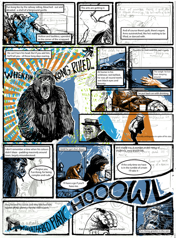
M: The visual nature of the poem enabled me to plan the layout of the panels and captions with ease. The first sketch of “Fun – Kong” was done in pencil and, after Rebecca gave me the green light, I scanned it and processed it digitally. I find that working with a tablet on the computer gives me a lot of freedom to make all the adjustments I need, try out different colour schemes and layer all my colour separations for the actual printing process.
With many comics/graphic novels, the artist will usually sketch using a pencil and then ink these outlines with a pen or brush. The inked black outlines work as a stylistic choice and a guide for colouring in. I generally tend to work using this style and even my linocuts are all done in such a way.
R: The draft sketches I received from Matthew were perfect and I was in no doubt we were doing the right thing. Inspired by what Matthew sent me, I adjusted the poem and Matthew adjusted the drawings until the final piece emerged. I didn’t want the text to be a stubbornly fixed element – I wanted to blur the boundaries and make sure the words and images coexisted in one unified whole.
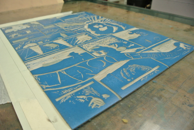
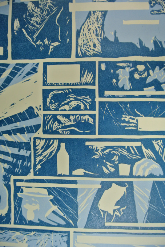
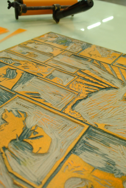
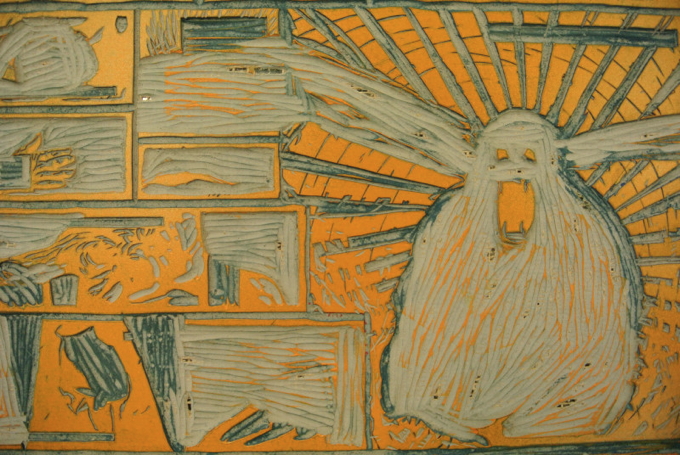
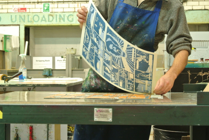
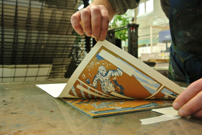
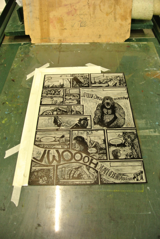
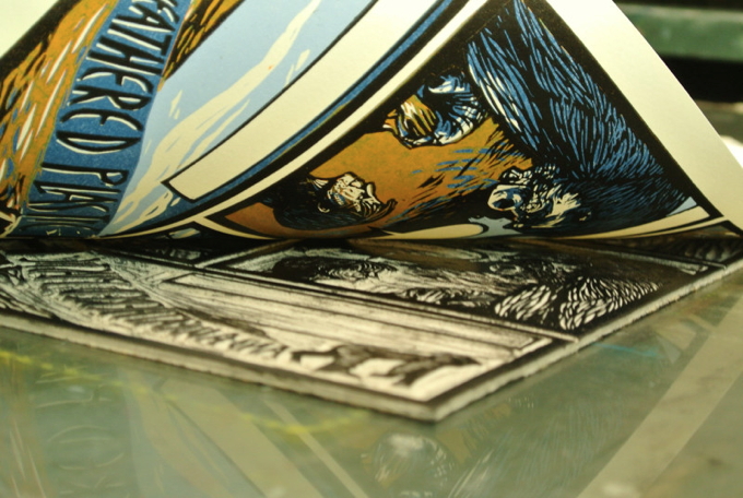
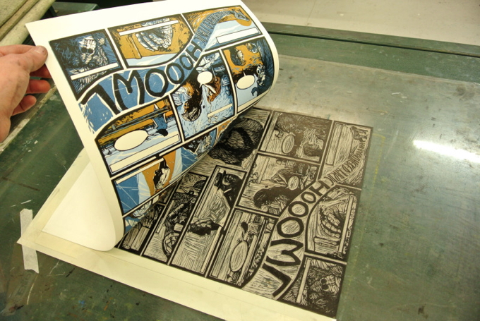
M: The final image was digitally printed out and the black outlines were transferred/traced onto the first block of lino. This is called the “key block”. I then carved it out, inked it and offset the black outline on a second lino block. Making sure registration is done correctly at this stage is key for a successful multiple plate linocut.
Once the black outline on the new block was dry, a second printout with all the colours was transferred on the lino, thus giving me a guide for the reduction method that would follow. In other words, I used the second block and the reduction method to print the three colours and finally, the key block to bring everything together.
My biggest issue was with the printed text, mainly because carving out small type on lino may prove extremely tiresome and ineffective. I was initially considering lead type but I am glad I chose to hand write the text and then screen print it over the complete linoprint. As I do not have much experience in screen printing, the text was done with the help of a fellow artist and dodo connoisseur called Martin McBride.
R: So now Fun Kong has a life of his own and may even lead to Matthew and I making more work together.
The Written Image exhibition is on display at Edinburgh Printmakers until 21 December.
More: The Written Image | Matthew Carey Simos | Rebecca Sharp
//////
Want to read more blogs by artists? Look here.



Comments