Newcastle based illustrator, The Cloud Commission explains his work process…
Born in the remains of a great seaside town in 1980, I was raised on bright lights and vivid colour, barely in time to witness the last hoorah of the great British holiday. Memories of being a small boy on a busy beach, faded with the paintwork in the theme parks and amusements, deck chair huts and cafés.
As an adult practicing illustration, I have accommodated and nurtured my childhood memories, maintaining a relationship with the bright lights of the theme parks, the cartoon world of wrestling, most American sports and illustrated characters. After an undergraduate degree in contemporary fine art practice, I felt inclined to reignite an inspiration less refined than the reference points of art school and to play around with the roots of my memory, exploring the same areas I chose to as a kid, rather than those I felt obliged to as an adult.
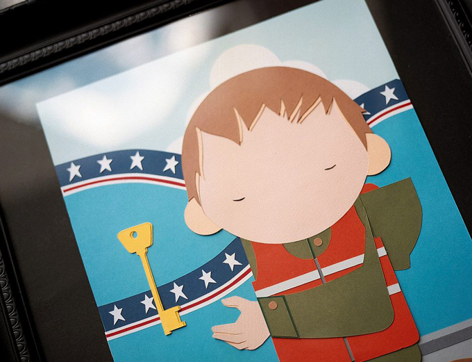
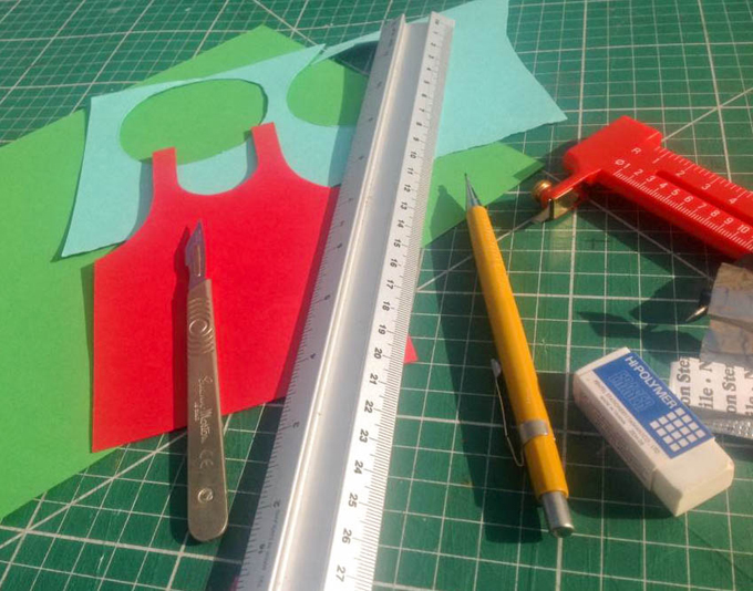
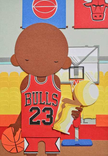
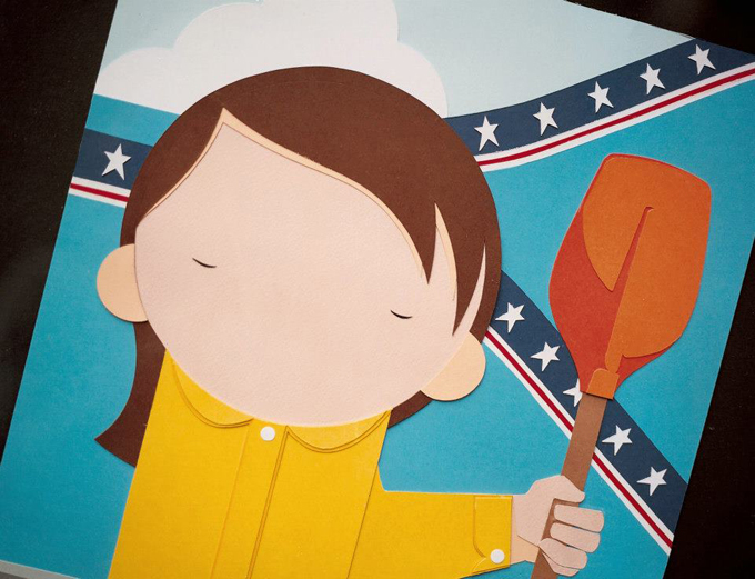
I started working with cut paper in my illustration about a year ago. My drawn characters up to this point often felt sluggish, with a heavy black outline, a style drawn from my years painting graffiti and something I had been trying to get away from. Coloured paper represented the least frustrating way of obtaining a solid, flat, vibrant colour without the frustration and waste involved in mixing paint… or the cost of buying a premixed for every colour I needed.
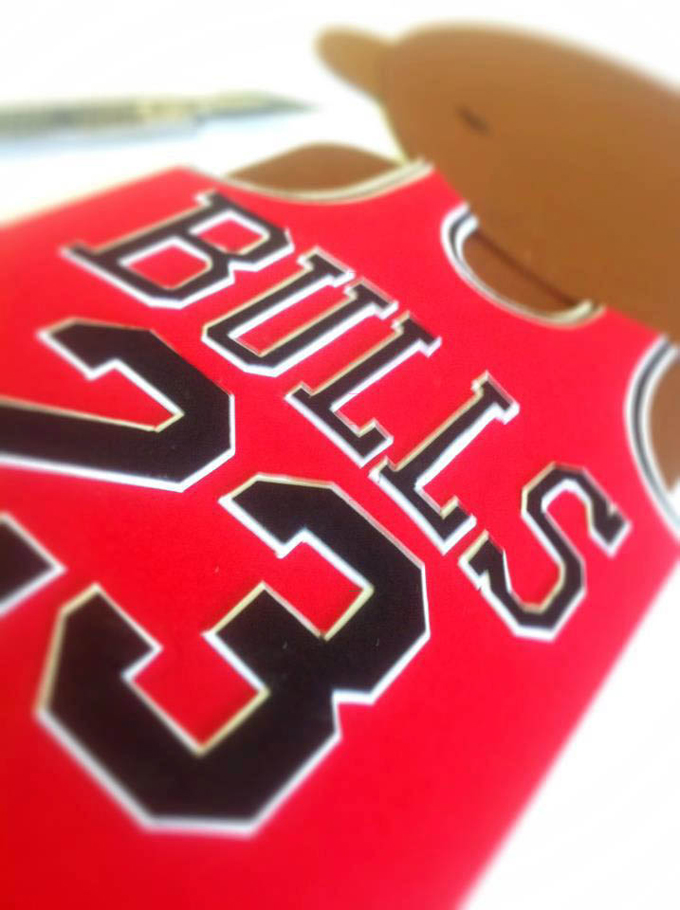
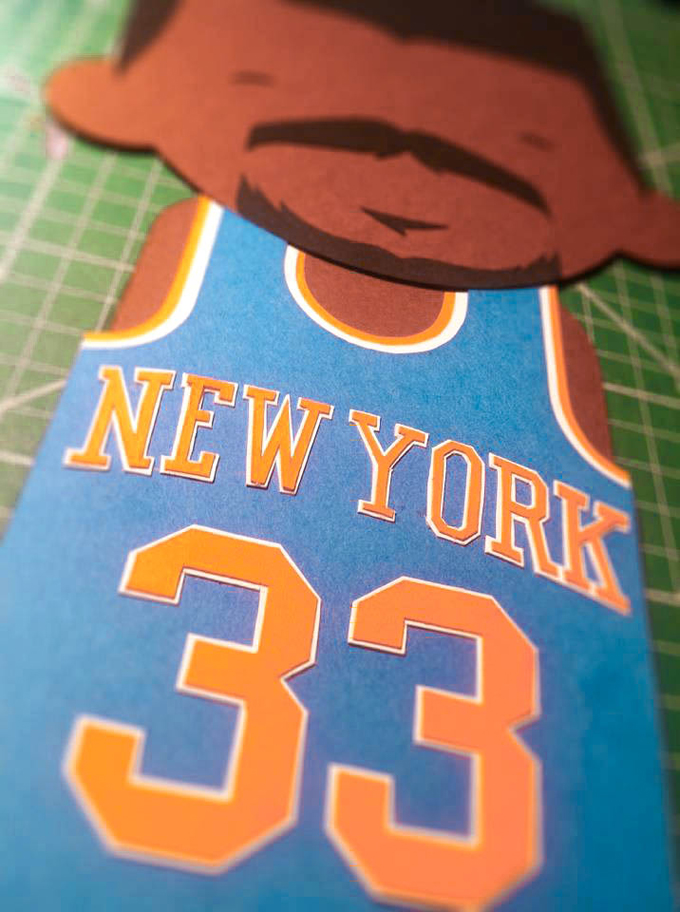
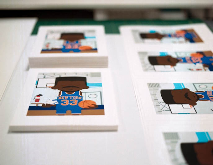
I get a bit obsessive about a process, forgoing all other processes, even my specialisms to focus on something new. 2012 became the year of the papercut and it’s all I seemed to be working on, whether commercial, commissioned or personal work. Over the year I created some of my favourite work to date, and for the first time began to capture something about my memory of childhood in an image. In regards to content, I drew from all of my interests as a child. For instance, I grew up playing basketball for teams throughout my youth and spent my downtime obsessing about NBA jersey design. I love the way it rarely changed, ignoring contemporary design trends, font choices etc to remain conventional and familiar, despite the obvious commercial opportunity in revisting designs on a regular basis. The colours where flat and bold, the font almost identical across the teams, and it represented something iconic, like a memory should. It became an obvious transition to replicate these designs in cut paper. This year will probably see my style evolve again, with a desire to work with texture, and on larger scales again. I am keen to explore an aesthetic with less structure, looser lines and the nurturing of mistakes.
Another big part of 2013 will be relocation to New Zealand by the end of the year. Due to a recent near fatal car accident, as well as serious illness in the family, it was decided that we shall move to be closer to our loved ones over there. Much of my focus will be an almost Blue Peter like fund-raising charge, taking on as many commissions, murals and projects as possible.
I’m hoping that with all their open space, farm belts and large landscapes, New Zealand is going to represent a better platform for outdoor work and larger scales. In the meantime, if anyone has any bright ideas for wall space, projects, murals, commissions etc… I’ll be happy to try and squeeze them in before I go!
More:
Website | Tumblr | Facebook | Twitter
//////
Want to read more blogs by artists? Look here.



Comments