As promised, more degree show reviews. Middlesex Uni had a (physically) huge presence at the Free Range shows in London. It took me all morning to go around the show (and that was primarily the graphic design section!). There was a range of work from print to video and a fair bit of photography. The quality of the work was on the whole very good with several excellent students standing out. It must be a diverse programme as the students seem to follow different streams of interest and project work.
My favourites were (all names are links to student websites where known):
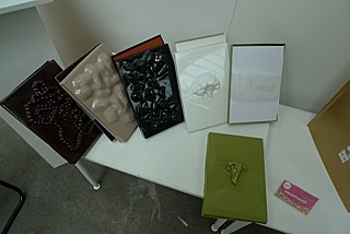
Lia Satzinger was perhaps my favourite with her playful approach to book design using unusual materials and approachs. As a student, I loved to experiment with materials and her work reminded me most of the fun of being a student before the tedium of corporate life (and white paper) sets in! So many students seem to do such commercial work, so it was refreshing to see a more off-the-wall, yet sensitive and beautiful, approach.
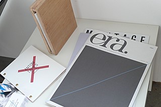
Matt Pell‘s work was beautiful and very professionally finished. It was hard to believe it was the work of a student. His poster for the Chelsea Flower Show was particularly good. He seems to have developed a signature look already (a diagonal line).
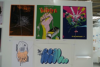
The work of Georgios Chararas was a breath of fresh air as I was beginning to weary. Student work that favours a more ‘urban’ approach tends to be poorly designed, overwrought or just plain bad. This work had a ‘street’ approach, yet the influence of graphic design, classic comics and silkscreening was apparent. He didn’t have a card, some work appeared to be missing and he wasn’t in the catalogue, so I don’t know how to see more, but here’s a photo of his display.
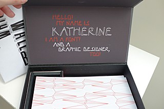
Katherine Stangl had a mixed show with an emphasis on typography. Her typographic treasure hunt was a personal favourite and her Richard Wright booklet was also very well executed. She also developed a typeface for herself using the dimensions of her own face (pictured here).
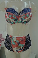
This show was huge, so I feel I must mention a couple other favourites. The best graphic designer with a non-graphic design, yet totally useful design was Elizabeth Hall and her underwear designed for wearers of colostomy bags (an RSA project in conjunction with De Montfort Uni). I also loved the photographs of Max Knodel. The illustration work was excellent and the sonic arts work, fascinating.




Comments