University for the Creative Arts at Free Range 2010
This show was a little confusing. The work was scattered and the degrees mixed up. I found it hard to figure out the precise difference between Graphic Design: Visual Communication and Graphic Media. From what I saw the work of the former was stronger. This was another big exhibition and the layout made it hard to navigate leaving me pretty exhausted by the time I got to the really good stuff (a table of handmade books).
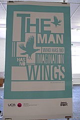
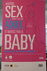
What this show excelled in was promoting individual student work. There were large banners with examples of work along with the student’s name and degree. Most students supplied a CV and/or a postcard with an image of his/her work and a nice little explanation of his/her work and profile along with contact details.
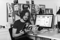
(above – Sarah Winter and Sam Hogg)
There was a lot of excellent work, but two clear favourites for me (again, the names are links if available):
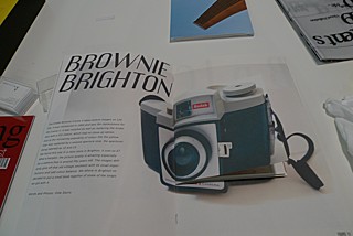
Mudi Chris Eghweree makes beautiful books. His work has personality and spirit as well as style and substance. You can see his personal involvement with the subject and that makes it all the more wonderful. 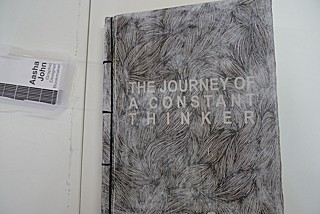
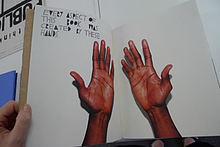
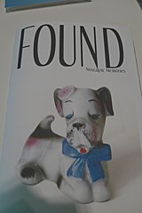
Oliver Storrs was another excellent student in the show. His Found magazine followed a really similar brief to something I did in my final year only it’s much, much more beautifully executed. As a teacher, I’m a little reticent to plug his work after noticing the many spelling/grammatical errors in his postcard, but I’ll forgive him as his work is fabulous.



Comments