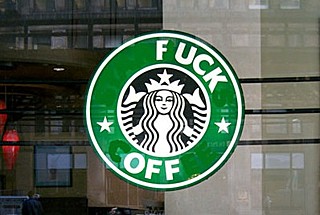
The first design ‘event’ of 2011 was a classic Emperor’s New Clothes moment – the emperor in this case being a 40 year old siren paraded by her CEO as “our new brand identity… giving us the freedom and flexibility to explore innovations and new channels of distribution that will keep us in step with our current customers and build strong connections with new customers”. The design crowds online frothed with opinion on the aesthetic, but almost everyone seemed to want to ignore what the tits were saying.

Image: Vacuum Cleaner ‘Fuck Off’ Logo Recall
In terms of design strategy, the new stripped down Starbucks execution does make eminent sense. What was surprising was that it was out of step by a decade or more with other major global brands in the trend for reductivist logos as ubiquitous signature (you may have noticed the likes of Nike relying less on the old ‘swoosh’ and offering up heritage themed diffusion lines like Nike Sportswear, to get the hipsters back in tow).
The real design innovation is coming down the line (Digital Networks and Facebook tie-ins) and this little bit of
re-engineering just clears the path for that.
—————————
Anyway, this is where we’re at. A big logo gets thrown into an ocean of design blogs and a quickly polarised debate of “I liked the old one better” vs “Isn’t that clever” emerges*. But little else beyond.
I’m curious about how the design community reacts, evolves and positions itself in relation to the notion of ‘branding’ in the real, everyday world. I’m being honest here. I find it confusing, and hard to take a definite position sometimes – where are the ethical boundaries of what we do? What are the aims of designers – to make things better? To make things look better? To just sell more stuff?
By the way, I’m not saying coffee is evil. Or design for branding is for that matter. That’d be stupid, I indulge in and rely on both on a daily basis. (In fact that might be a vicious circle I need to get out of). I did spend some formative years in the midst of anti-capitalist marches, Adbusters, and Naomi Klein. It’s good they’re still fighting and arming us with information, but ultimately I found their strategies to be laudible, but predictable and a little bit lame.
This is really just a call out, at the beginning of this ‘Focus On Design’ month, for an upping of the ante when it comes to online design criticism – here or anywhere else. Let’s scratch at the surface now and again. Stoically defending the industry in the face of lazy journalism about how much design costs is encouraging, but lets also be honest about the true value of what we do.
I’m optimistic about the development and redefinition of ‘branding’ and design. I enjoyed Neil McGuires recent link on here to Metahaven’s rebranding of Wikileaks, and their notions of ‘image economies’. Their apparent short-circuiting of a countercultural publishers is pretty funny. Ultimately I’m interested in how they’re signposting new strategies for design and branding, and their understanding of what happens online, and that maybe it’s less about ‘brand’ and more about identity.
Links:
Articles on Starbucks Rebrand:
http://www.creativereview.co.uk/cr-blog/2011/january/starbucks-new-logo
http://www.logodesignlove.com/starbucks-logo-evolution
http://www.thedrum.co.uk/news/2011/01/12/17584-starbucks-to-bring-free-digital-network-to-uk-/
http://www.guardian.co.uk/business/poll/2011/jan/06/is-starbucks-makeover-worth-it
Vacuum Cleaner ‘Fuck Off’ Logo Recall
http://thevacuumcleaner.co.uk/recall/
http://www.starbuckscoffee.org.uk/sos/home/index.html
Metahaven


Comments